Integrity
66% D
Context, meaning, and consistency issues carry the largest risk.
One real Marketing Channel Dashboard audit. See the visible evidence, the integrity findings, the executive interpretation each issue could distort, and what should be fixed first.
The software is the proprietary audit engine. The value is the decision risk it makes visible.
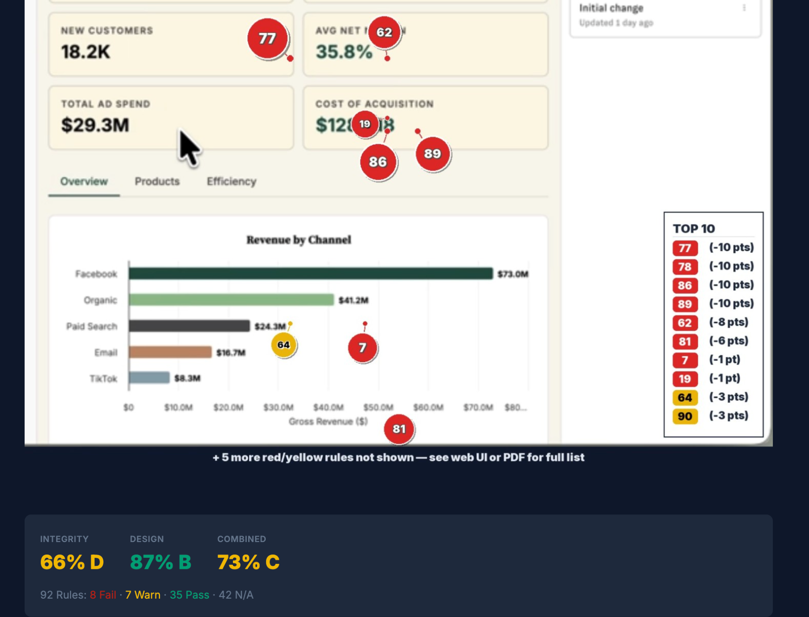
The dashboard looks polished, but executive trust requires more than visual quality. The audit tests whether important numbers are sufficiently contextualized, consistently presented, and safe to interpret quickly.
Context, meaning, and consistency issues carry the largest risk.
The dashboard is visually organized and largely readable.
The integrity findings pull down an otherwise strong visual result.
Follow one real Marketing Channel Dashboard from annotated evidence through ranked findings, severity, heatmaps, and category drilldowns. The workflow exists to support a defensible finding, not merely a score.
Use the speed control, pause anytime, or move one screen at a time.
These are three high-priority findings documented in the audit evidence. The important question is not merely which rule failed, but what leadership may infer from the chart and what evidence makes that inference unsafe.
Six prominent KPI cards show absolute values without immediate baselines, targets, or trend indicators. Leadership sees the current number without enough context to judge whether performance is improving, deteriorating, or missing plan.
The dashboard includes an “All Years” filter, but it does not clearly state the period covered by the KPI cards or Revenue by Channel chart. A viewer may assume a reporting window or comparison period that the dashboard never actually discloses.
Cost of Acquisition displays $128.418 while Gross Revenue and Total Ad Spend use $163.6M and $29.3M. Inconsistent scale conventions increase the chance of misreading magnitude during a fast executive review.
A 77 Rules engagement preserves the review loop from evidence through remediation: validate context, document the finding, correct the risk, and re-audit the dashboard.
Open the ranked findings or use the heatmap and category views to inspect the full result.
Remove a finding from consideration when the visible evidence does not apply to the dashboard’s actual context.
Use the PDF action to preserve and share the completed audit output.
Upload the corrected dashboard and run the audit again to see what improved.
The video shows how a dashboard can look strong on design while still containing integrity issues that deserve review before leadership relies on it.
Bring one real dashboard or board-deck chart to a private integrity walkthrough.